mCommerce in Ukraine: 10 Must-Have Features for Business
If yesterday everyone was talking about eCommerce, today it’s all about mCommerce — mobile commerce. Buying from a smartphone has become a habit: we use it to order food, call a taxi, or book a doctor’s appointment or a haircut.
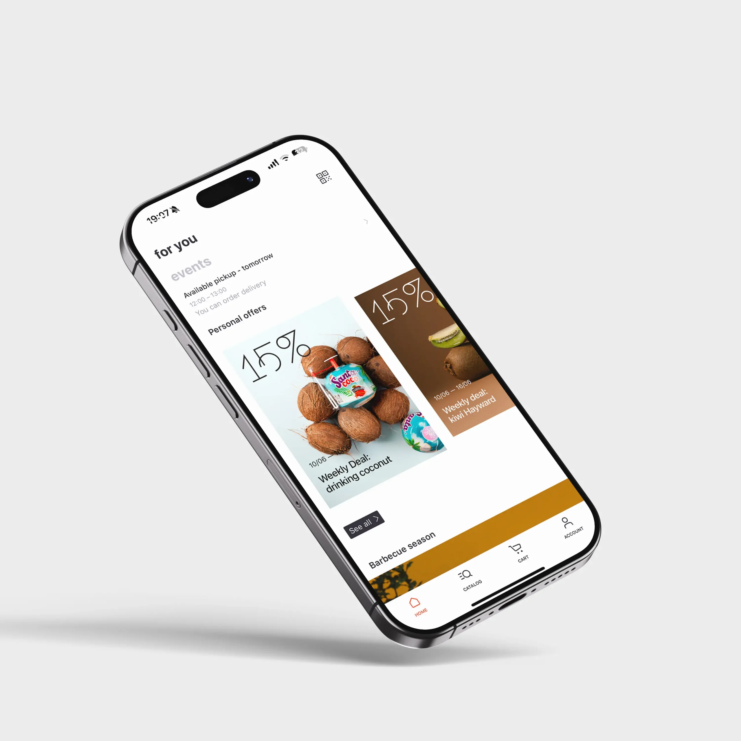
Over the past three years, we’ve designed six full-scale mCommerce platforms: some based on mobile apps, others on websites, and even standalone B2B software. For example, the goodwine app (case), the BadBoy app (case), or the FABO website — all of these are our projects. So now we’re ready to share our knowledge and experience — you bring the shares and questions.
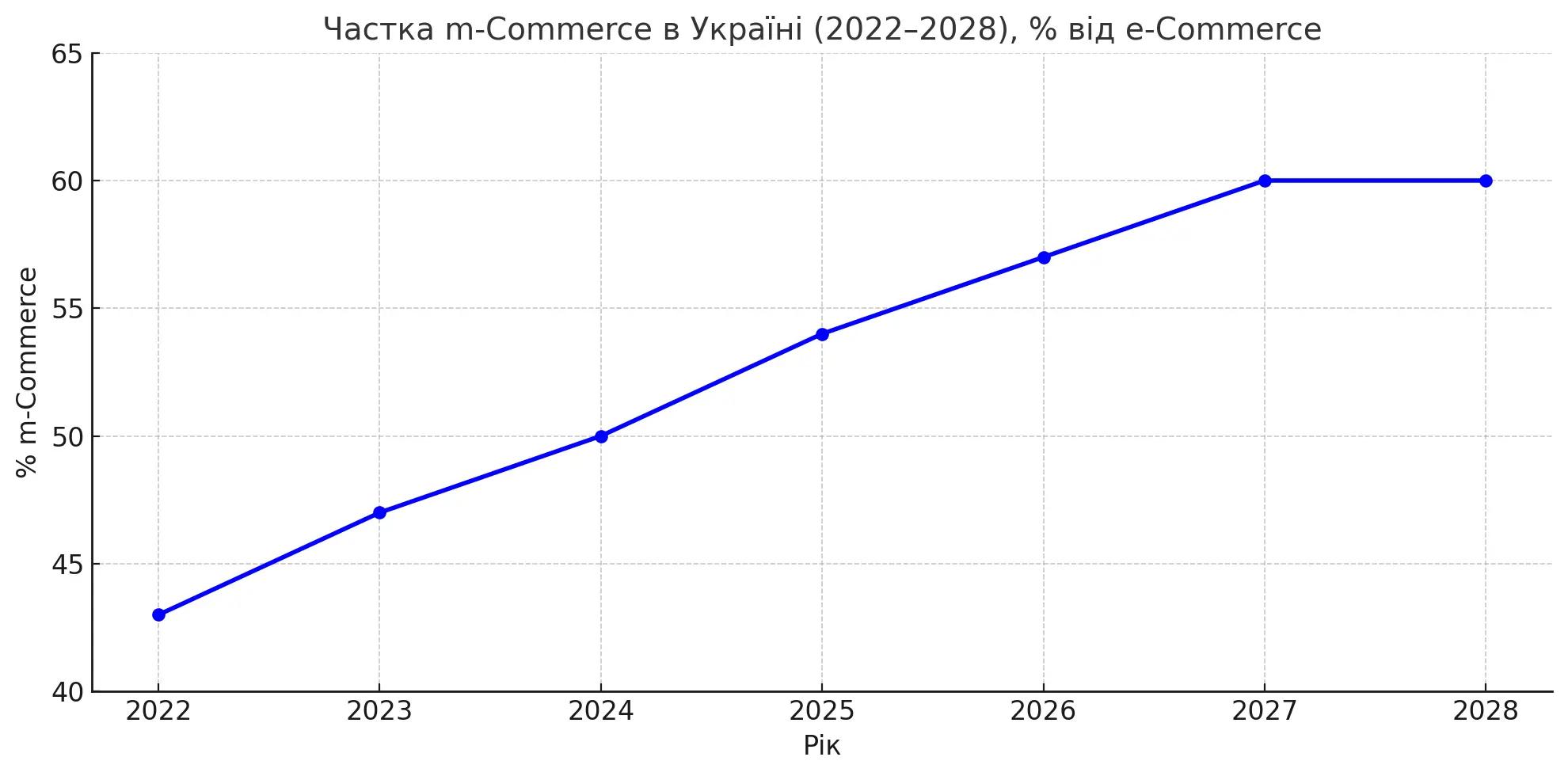
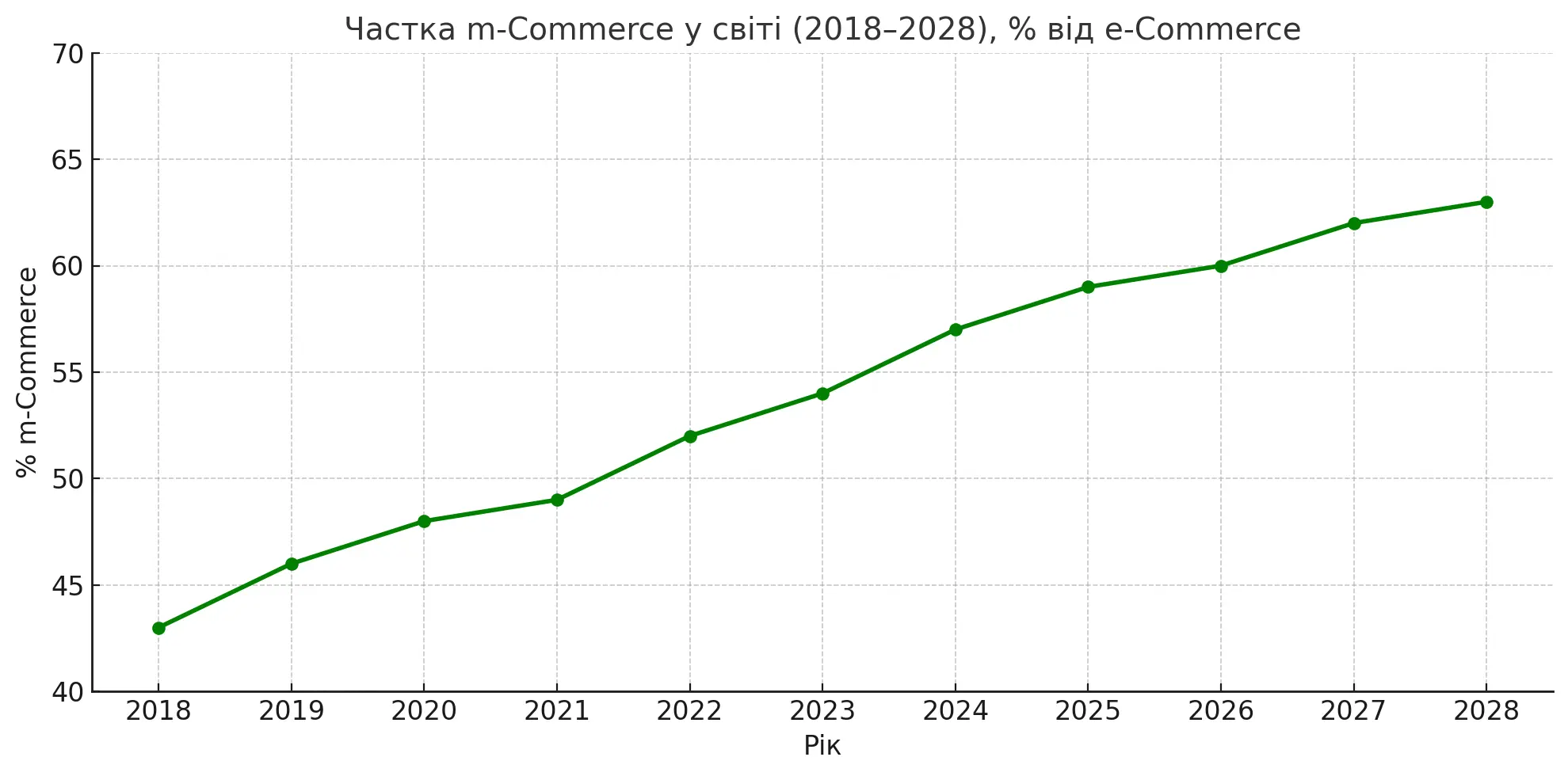
Let’s start with the numbers behind the growth of mCommerce in Ukraine and globally
Share of mCommerce in Ukraine (2022–2028), % of eCommerce
Global share of mCommerce (2018–2028), % of eCommerce
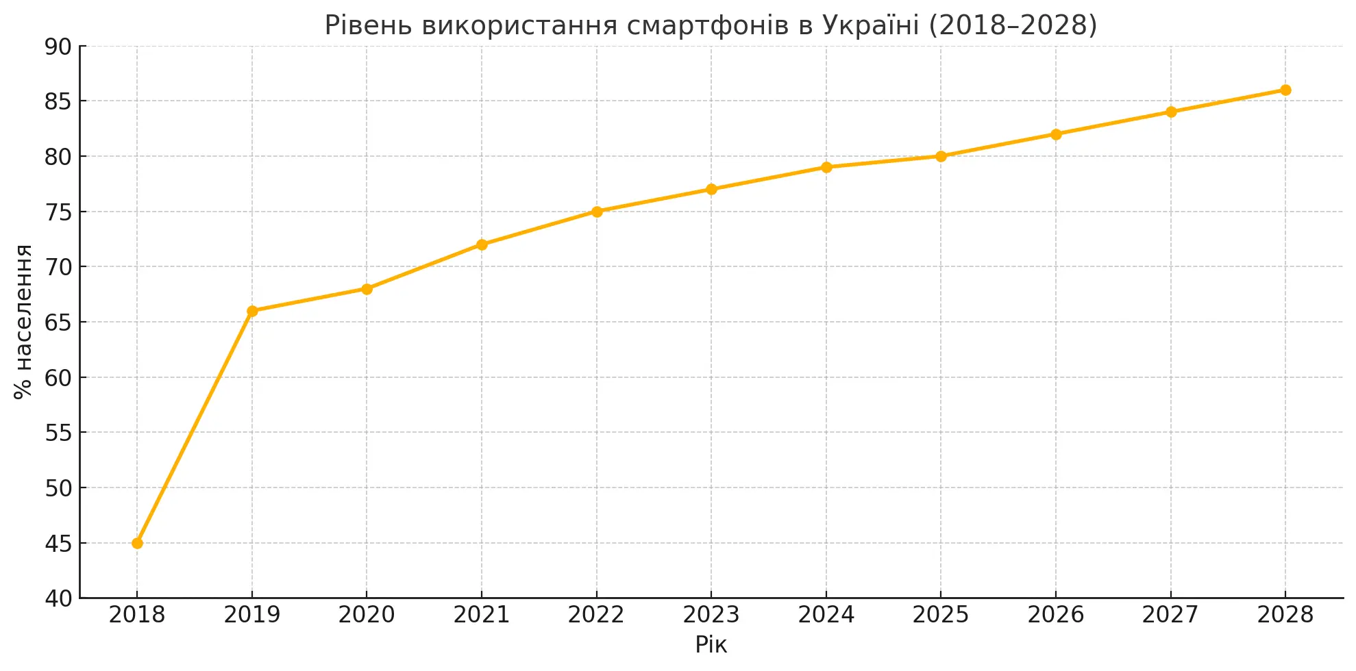
Smartphone usage statistics
Smartphone penetration in Ukraine + forecast (2018–2028)
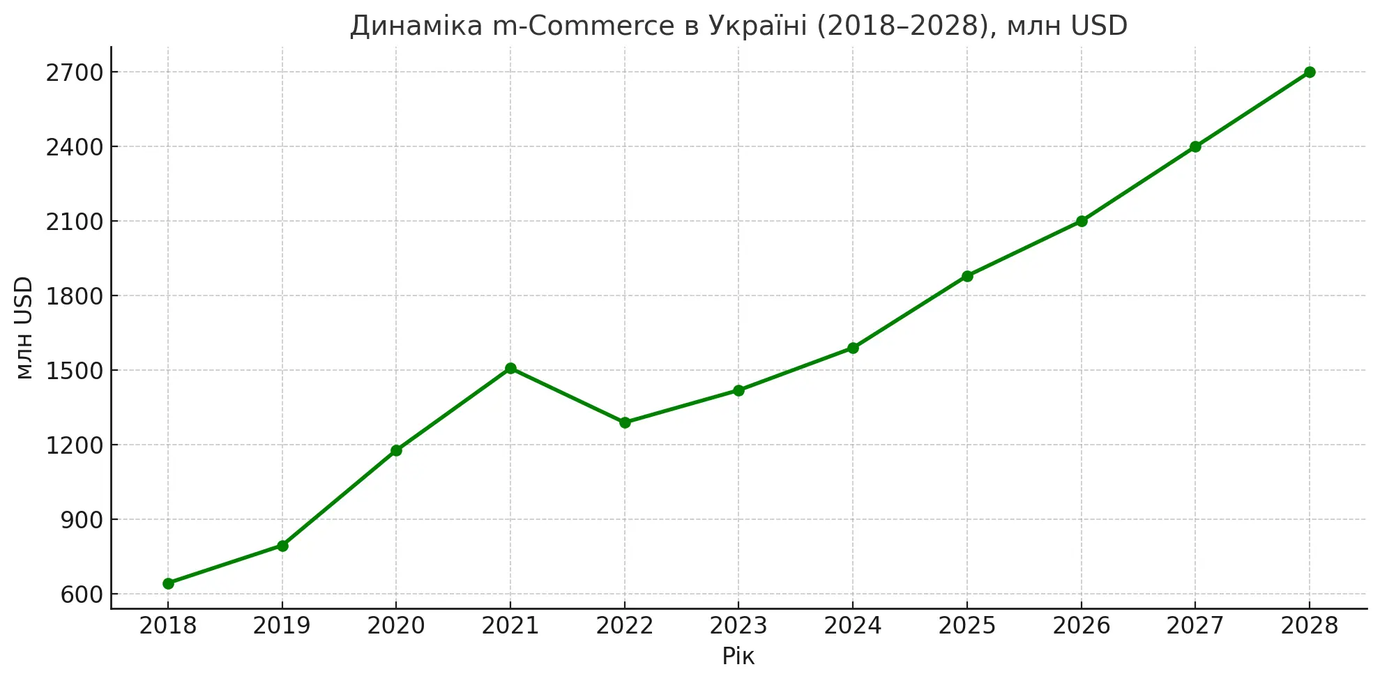
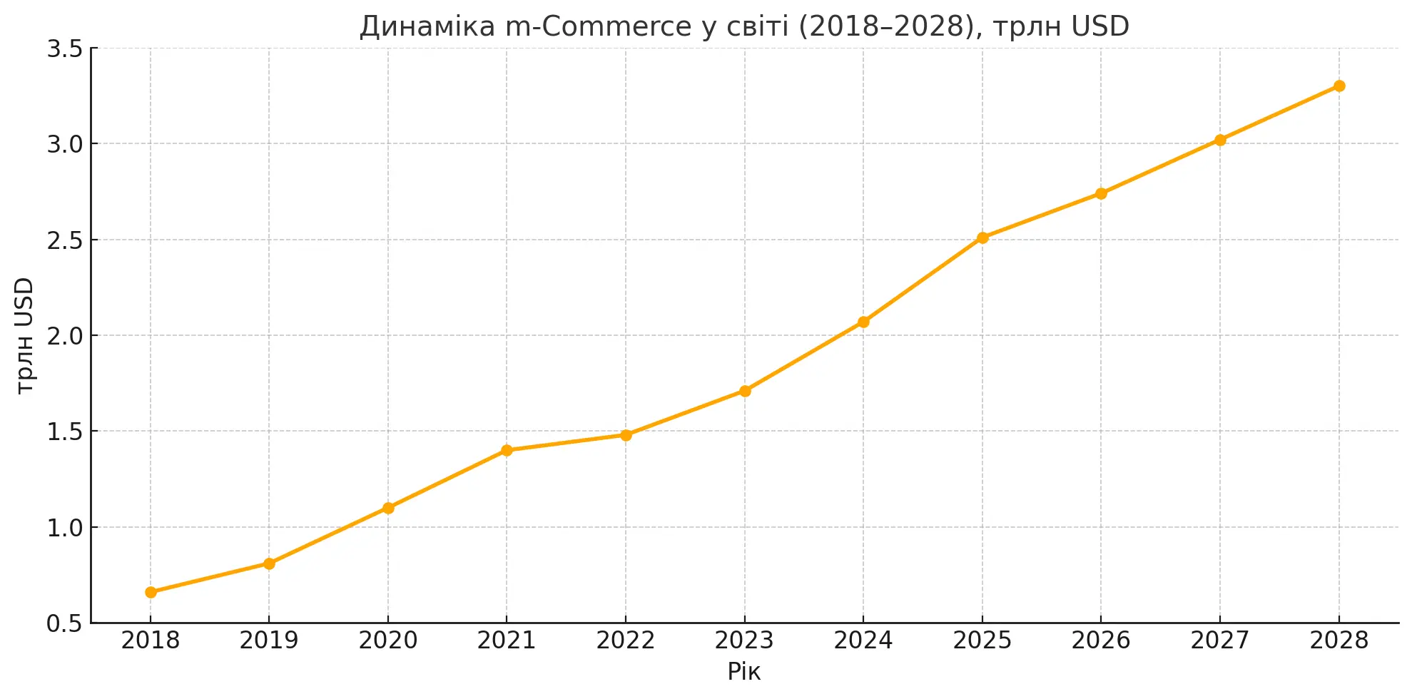
Sales dynamics of mCommerce in Ukraine and globally
mCommerce sales in Ukraine (2018–2028), mln USD
Global mCommerce sales (2018–2028), trillion USD
More than 80% of Ukrainians own smartphones.
We’ve gathered 10 features that will help your customers buy faster and easier from your mobile site or app.
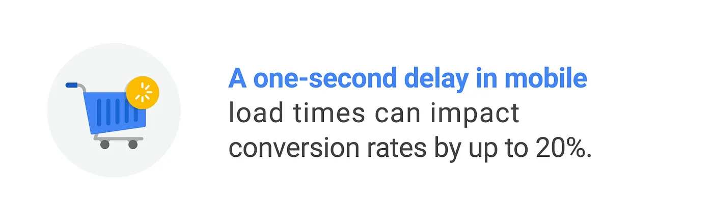
№1. Fast loading speed: every millisecond costs you money
Nobody likes to wait, especially for a page to load. Buyers are picky, and there are hundreds of alternatives — so brands are fighting for every second of attention.
https://www.thinkwithgoogle.com/marketing-strategies/app-and-mobile/mobile-site-speed-importance
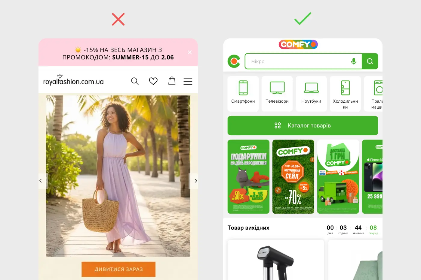
№2. High-quality product photos and videos
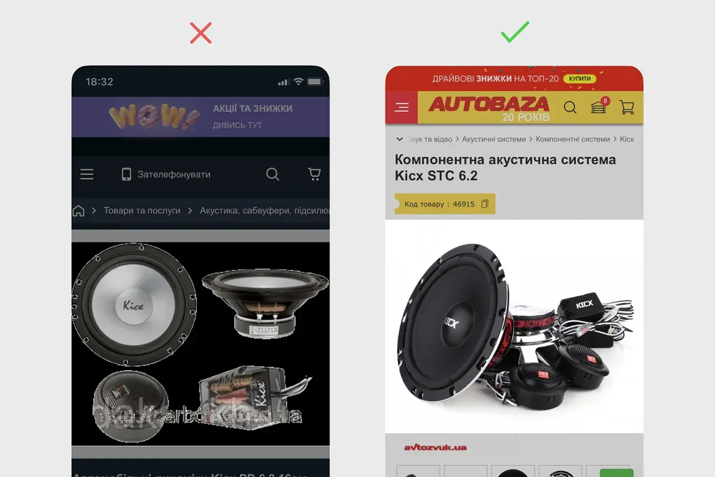
If Instagram users have crisp photos, your site should too. Product visuals shape how your brand is perceived. First impressions matter. Don’t save money on visuals — and make sure they’re optimized so they don’t slow down your site.
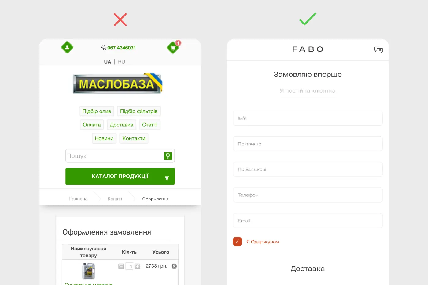
№3. Short registration forms + Apple/Google Pay support
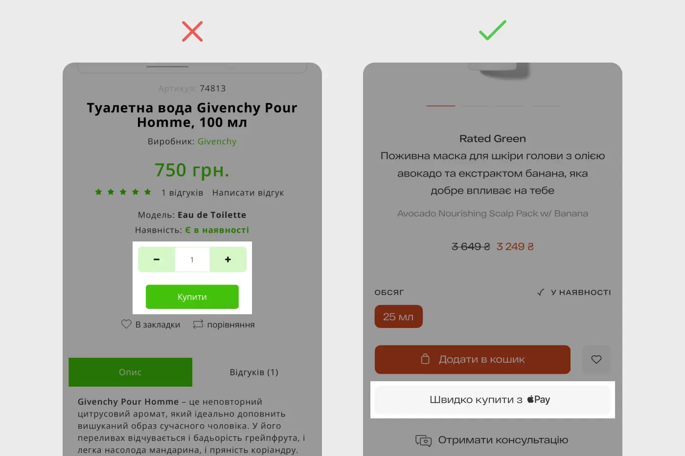
Registering or buying in one click is a major user demand. Every extra input field makes people think: “Do I really want to do this?” Reduce friction. Fewer forms = more sales.
№4. One clear login method
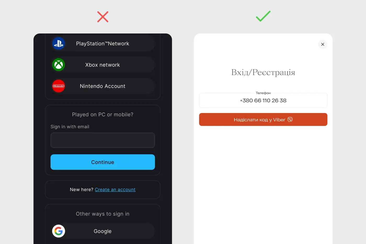
People often forget which login method they used. Multiple login options clutter your stats and confuse users. The best solution: login via phone number and SMS code.
№5. Helpful content where it’s actually helpful
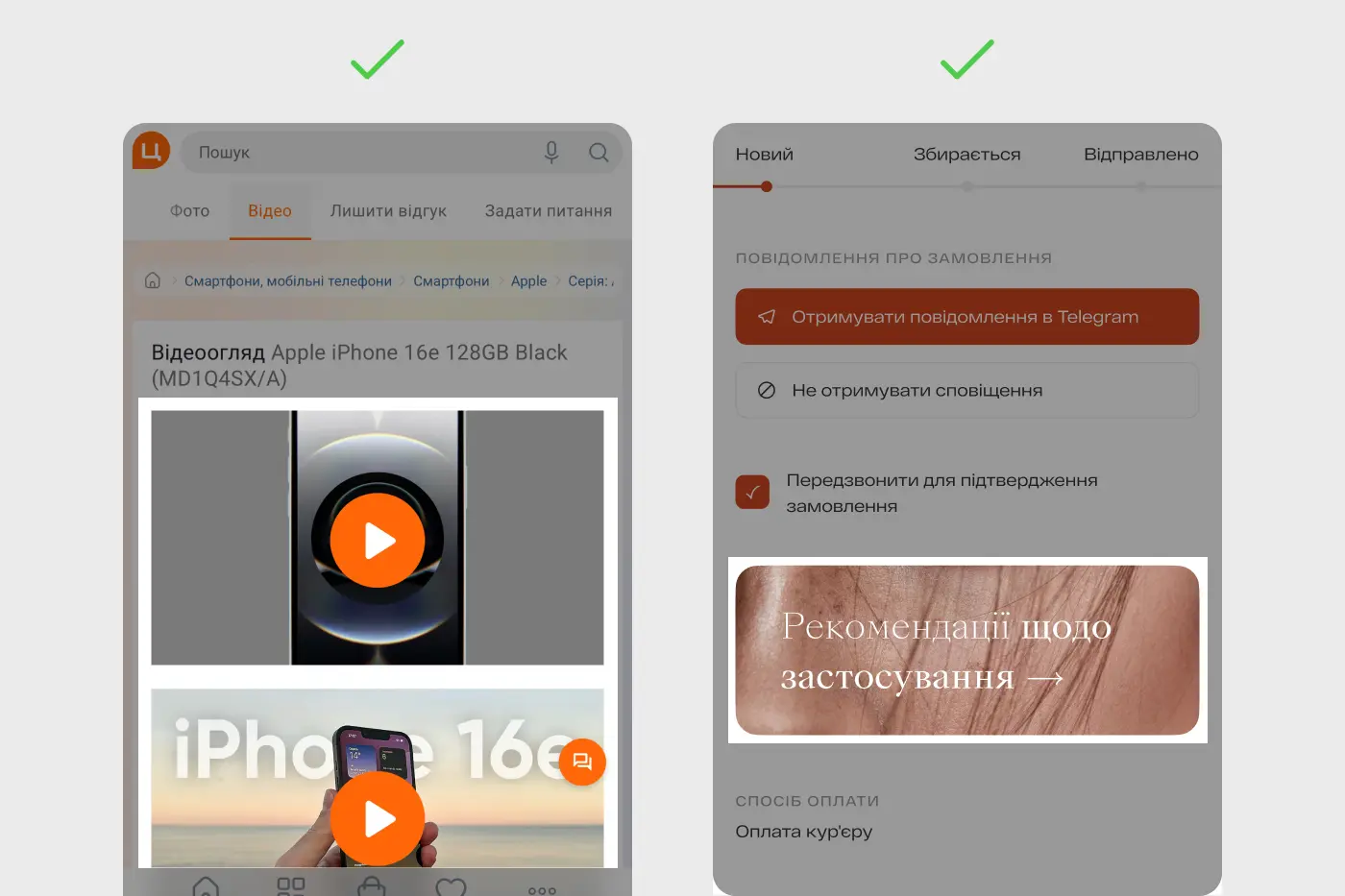
Anticipate your users’ questions. Add YouTube reviews, instructions, tips — whatever helps with decision-making. Put yourself in your audience’s shoes and be genuinely useful.
№6. Gift wrapping option
Just add it — free or paid. It saves time for users buying a gift and lets them send it directly to the recipient. Small detail, big convenience.
№7. A homepage with stories, not just product tiles
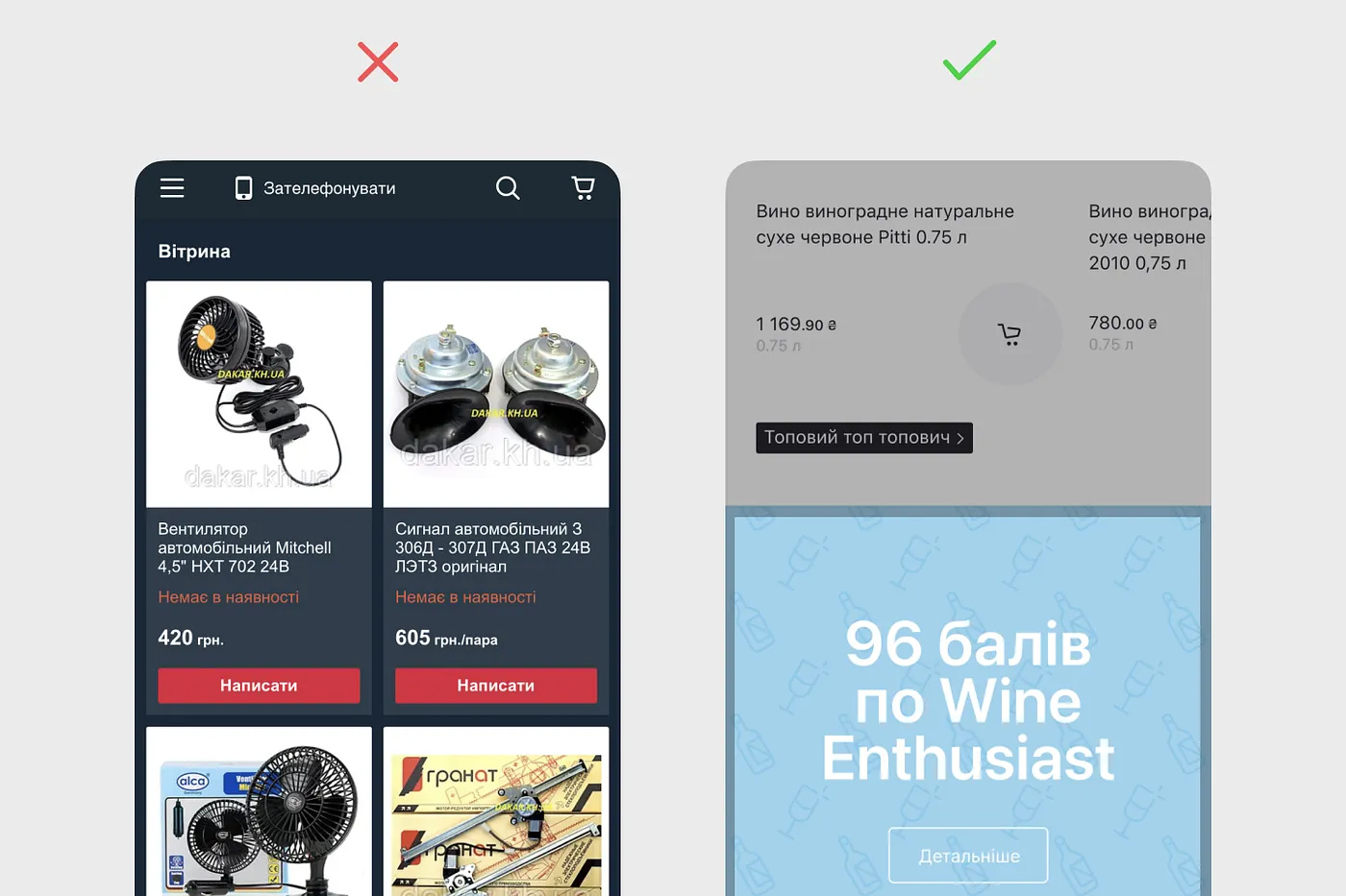
Let your homepage tell a story. Who are you? What’s new? Why did you launch this product? Show the people behind the brand, their passions, and motivations. Every brand has a story — tell it.
№8. An expert who knows and recommends
People don’t want to spend time researching. It’s easier to trust an expert or influencer who’s already done the homework and offers their top 3–5–10 picks. People buy from people — always have, always will.
№9. Let customers choose delivery date and time
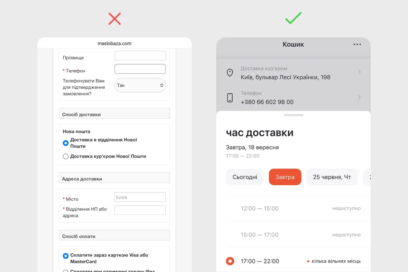
No one wants to sit and wait for a courier all day. Give users control over when and how they receive orders.
№10. Stop waiting — launch your mCommerce now
It doesn’t have to take forever. From idea to launch, the first version of our goodwine app took just four months. Then we spent the next three years improving it, adding features, and refining the shopping experience.
🎁 Bonus tips:
- During checkout, remove all distractions — no links in the logo, no menu, no footer. Let the user focus and finish the process.
- Make the search bar prominent on your homepage.
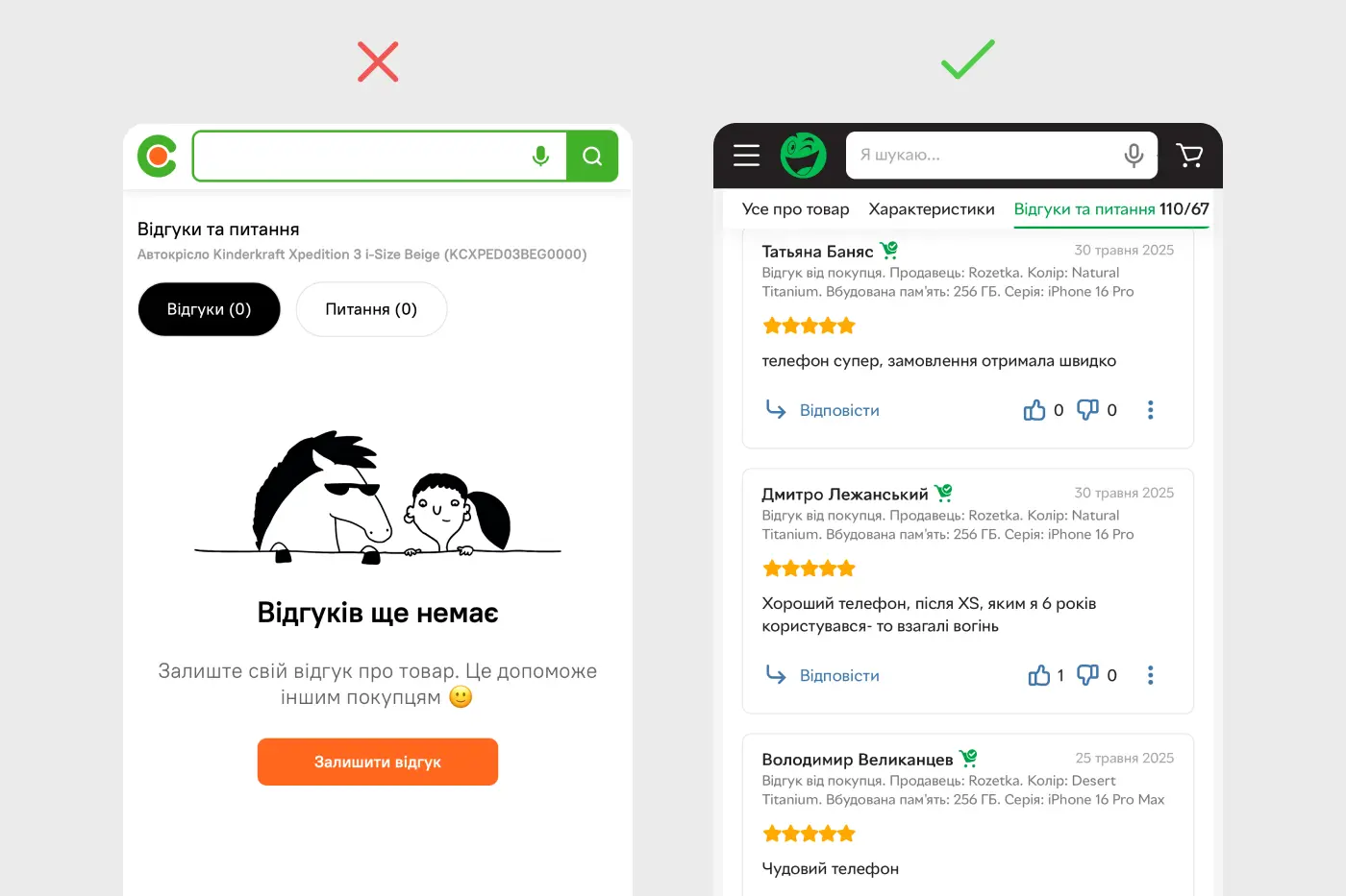
- Show real reviews. If you don’t have any — start asking for them.
- Offer related products or bundles at a discount.
- Let users save favorites — it builds habit and return visits.
- Use detailed filters for niche products so it’s easy to find the right item.
- Make the “Buy” button thumb-friendly. According to MIT Touch Lab, the average fingertip is 10–14mm wide. That means your CTA should be at least 48px high.