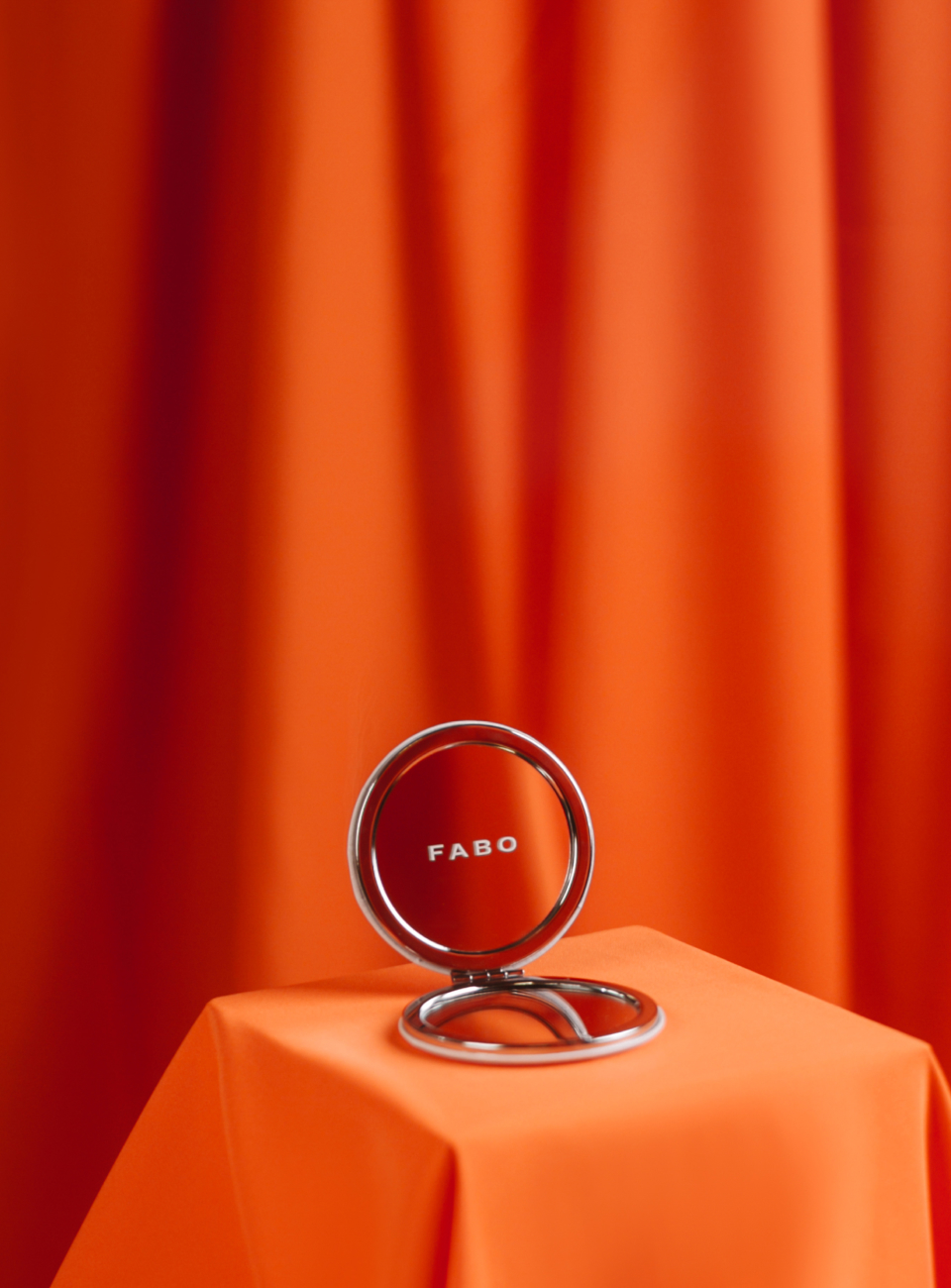
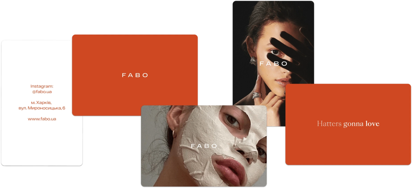
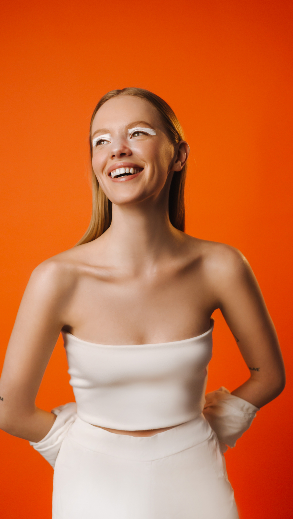
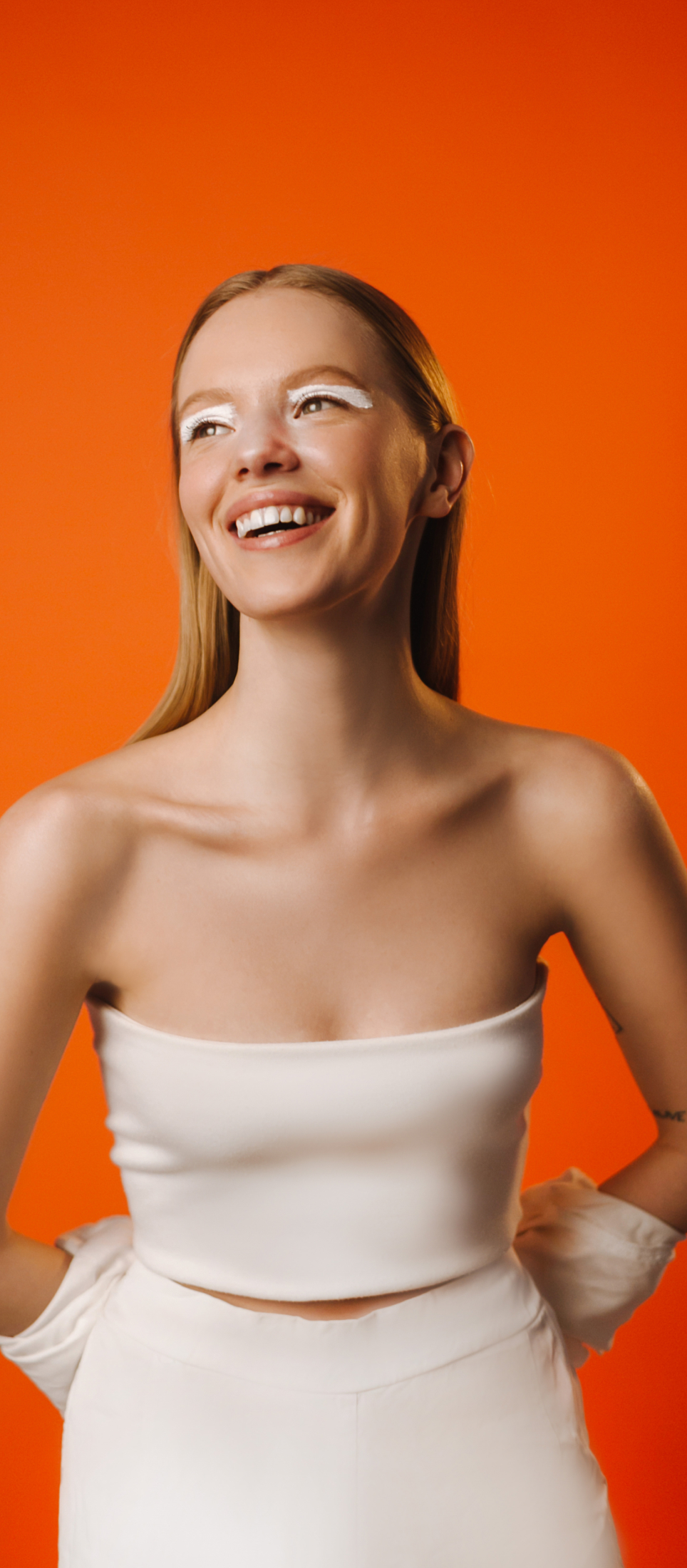
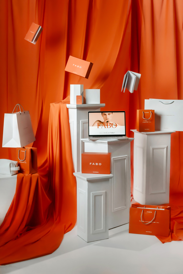
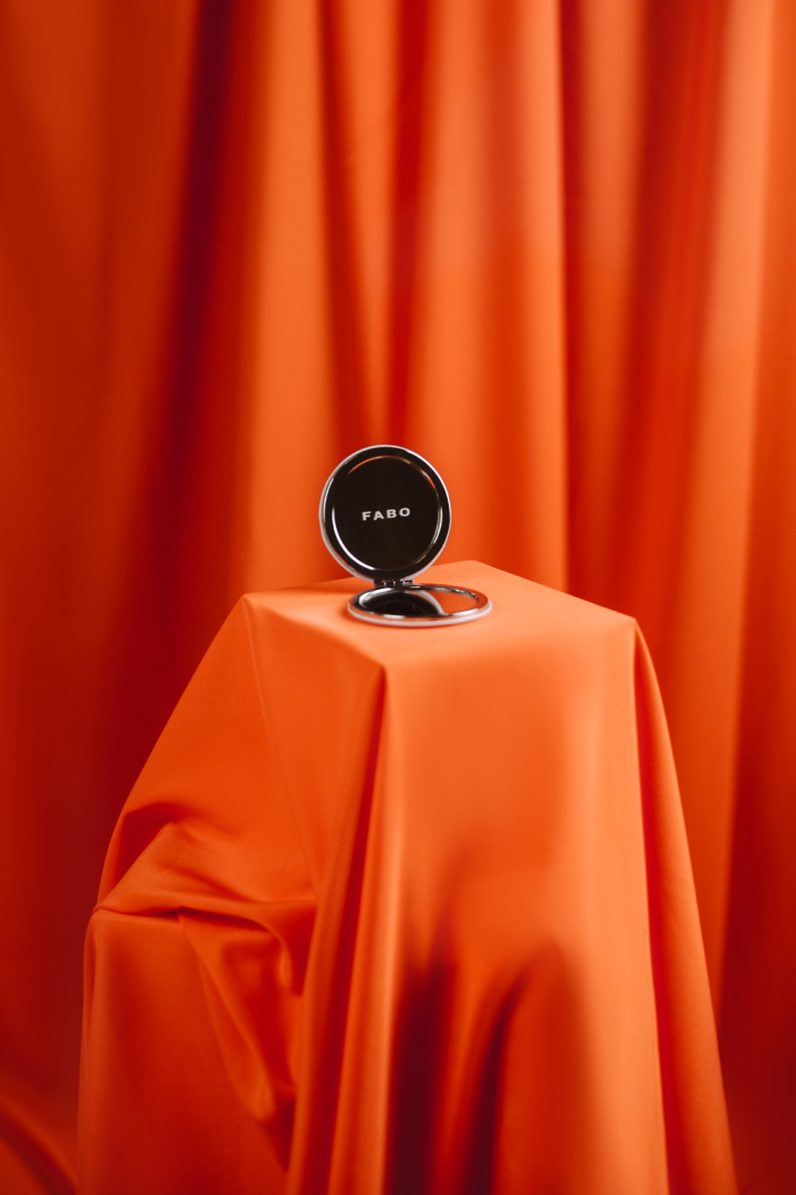
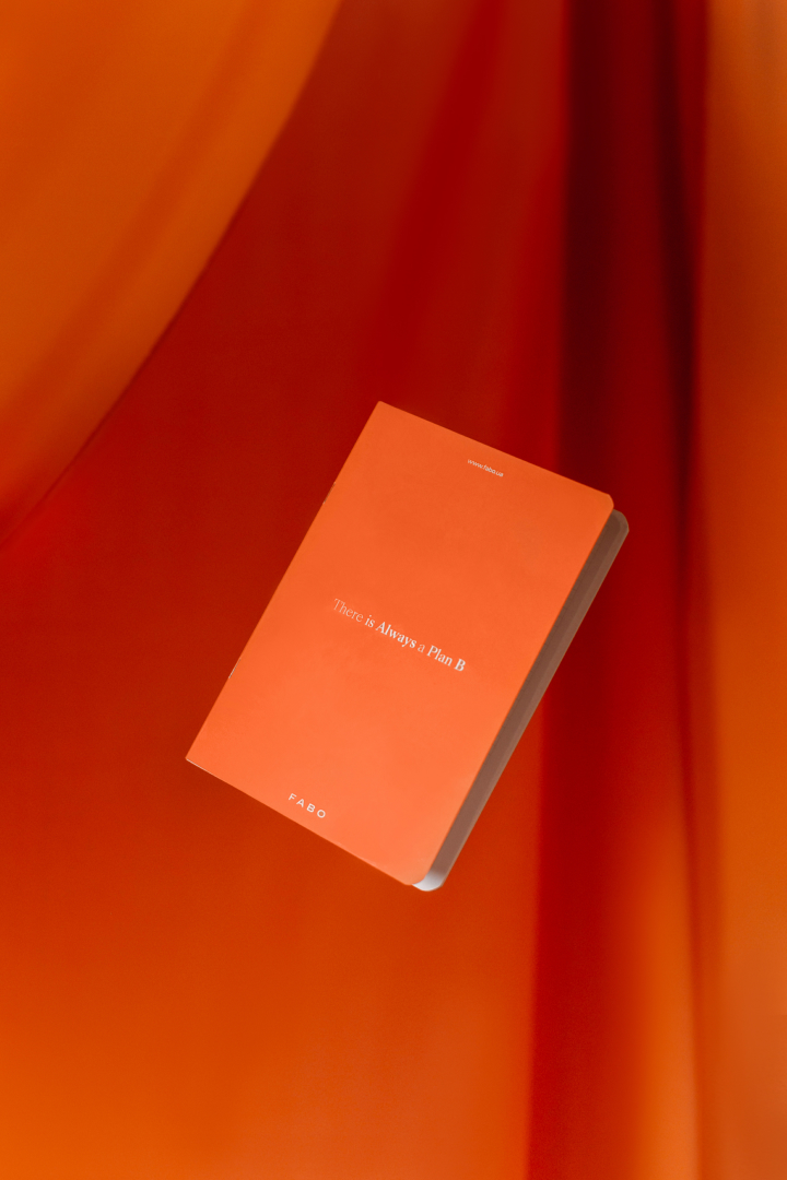
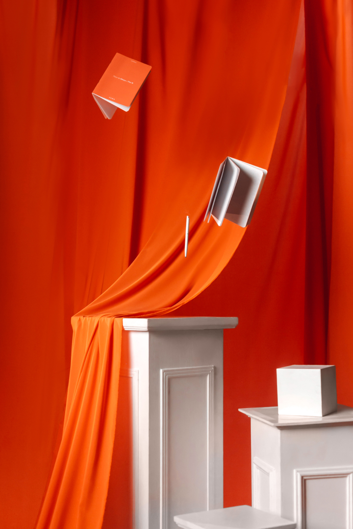
FABO
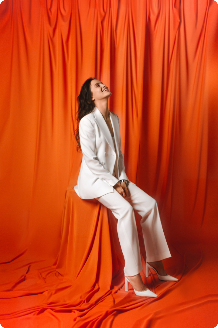
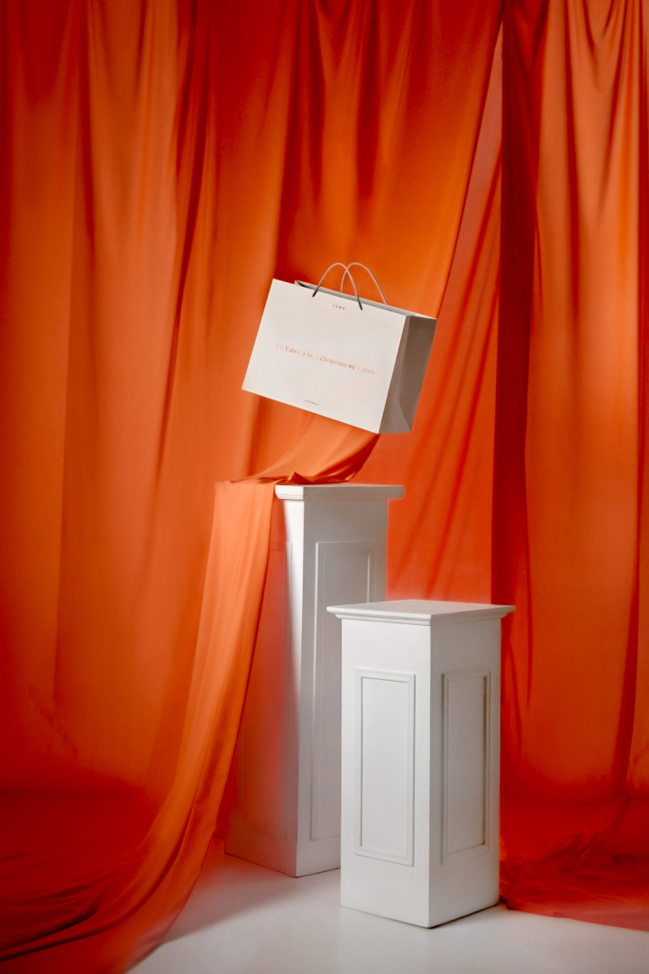
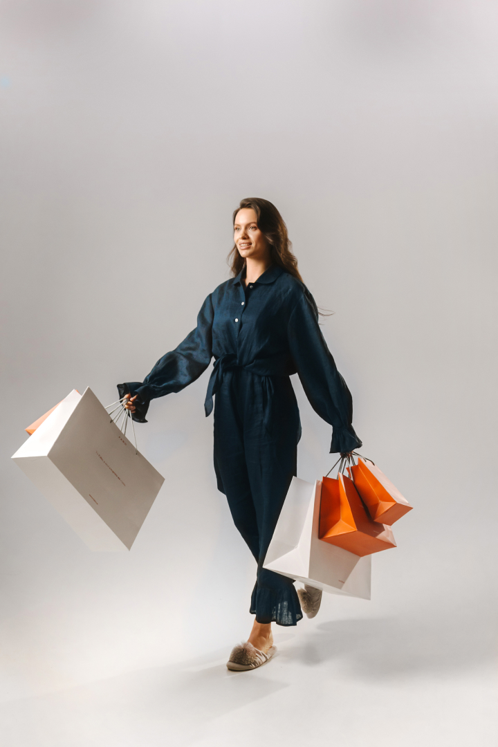
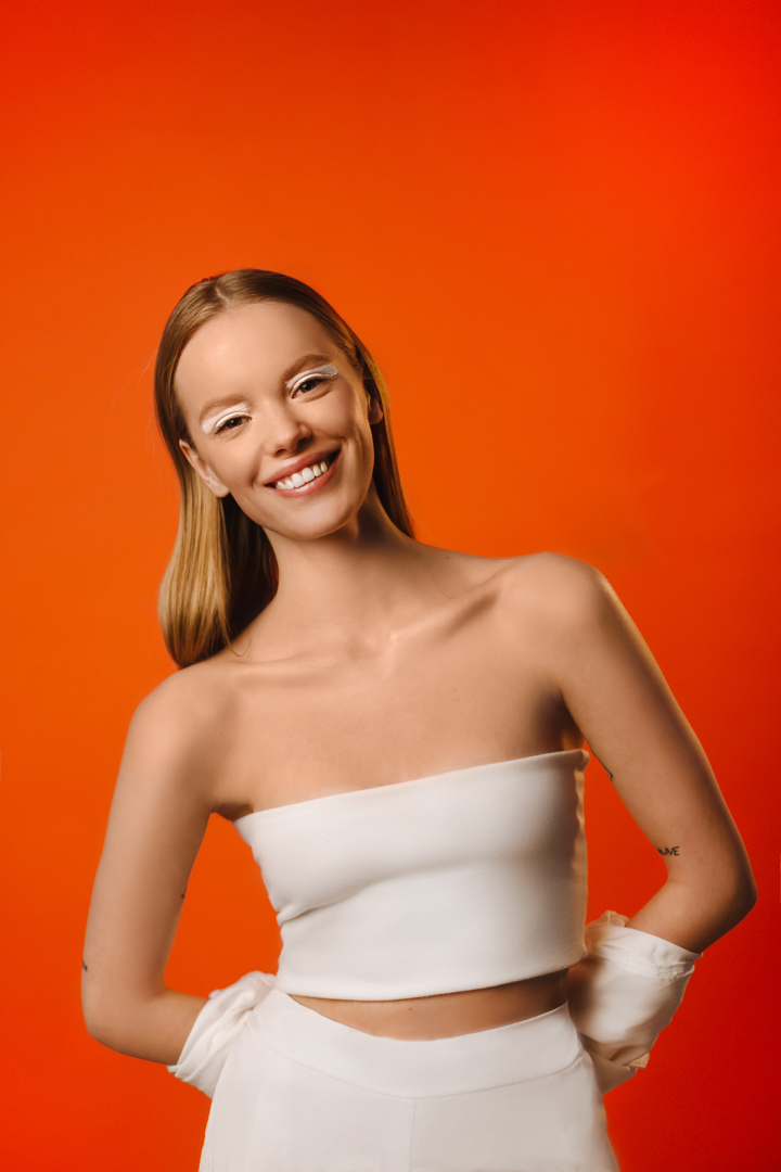
Re-branding of a premium cosmetics store
The project lasted 2 years. Everything from market research to website design and communication.
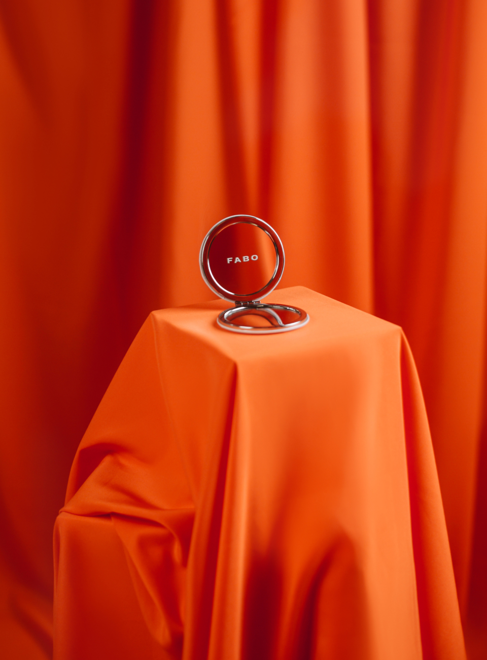


The project lasted 2 years. Everything from market research to website design and communication.

We’ll be happy to discuss your brand,
business goals and objectives
We have received your request 🚀
and we'll get in touch with you soon ✌